Tuesday, January 24, 2012

Incised Pop-Ups

Posted by Picasa


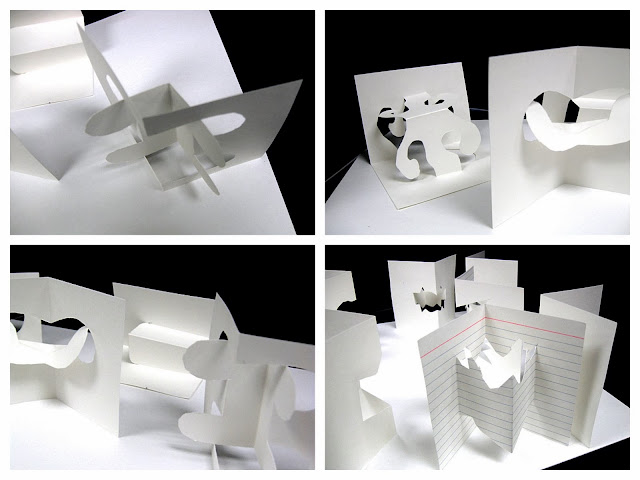
Pop -ups have such an enduring fascination.  The techniques we used here are not complex, but the transformation from two dimensions to three almost seems magical.

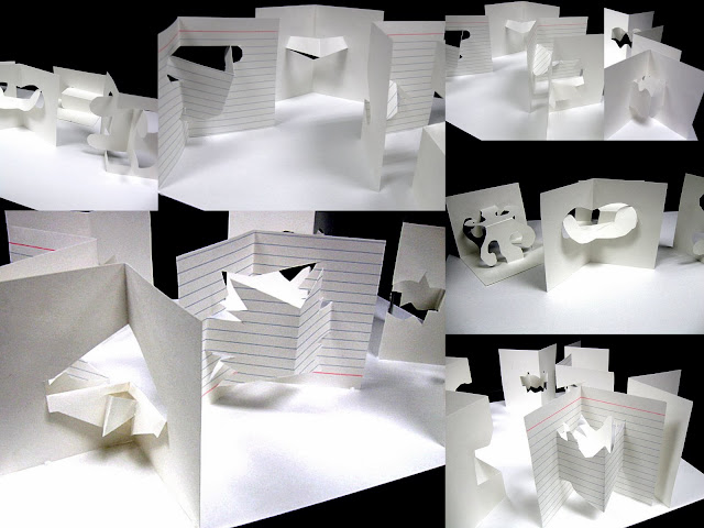
We used index cards and regular scissors.  First, everyone made all 7 of the pop-ups shown below (just to get the hang of it).  The ones you see above were new designs created by the students.
Fold index card in half vertically or horizontally.  Cut where you see a dash line and crease where you see a solid line.  It's important  to crease in both directions to really "set" the crease. We used the handle of the scissors to smooth the crease.   Open the card and just play with it a bit to get the pop-up.  


Monday, January 23, 2012

Favorite Tree

Kindergarten Watercolor Trees


I found myself walking around with a smile that couldn't be erased.  Every painting had a story poured into it.

We began by talking about nature and how throughout history artists have been inspired by it.  We looked at various artworks with trees and shared thoughts on how the artists may have felt about them.   We shared  stories of special memories with trees and moved forward with the painting.

Posted by Picasa

Friday, January 20, 2012

Imagining Underground Worlds


In this lesson the students worked as artists to imagine an underground world or setting.  The question was how could they, as artists show this place. We discussed how artists can use space and viewpoint as tools to communicate their ideas.  We looked at and discussed the quilt Mother Earth and her Children which you can see here,  it is such a fabulous piece to explore!  Another favorite part of this lesson is reading the thoughts and feelings the kids have about their work.  Having them write about it helps them understand their own work better and develop a true relationship with it.   As a viewer, it makes you go back and explore the artwork more thoughtfully by looking at the details and seeing things you failed to notice before.  Notice below what Rosaura wrote about the dad rabbit being afraid as he is watching the coyote; now look at the expression on his face.


Thursday, January 12, 2012

Abstract Crowds


Posted by Picasa

This lesson is about abstraction, simplification of shapes and overlapping.  We first made a few sketches in order to get the shapes super basic or simple.  They could choose any situation in which to place a group of people.  We used liquid watercolors to paint everything in except for the black bands, those were painted with black acrylic to get the opaque contrast quality. Wherever one part of an image overlapped another, that is where the color would change. When they were finished with the painting, they could choose whether they wanted to cut it into strips and reassemble it for even more movement.  Only one student  decided to take this risk which is the single image on top.  If you look at the bottom of the picture you can see how she placed her strips.  To sharpen everything up in the end, we used sharpies to go over the lines.


...And here is a video of the creative process at work!

Wednesday, January 11, 2012

Identity Through Name Design

Posted by Picasa

Identity- How Do The Colors Represent Me?

Jose:
The colors I chose for my Name Design artwork are purple and green.  Green shows that I am natural.  I know this because I don't drink or smoke or do drugs. Plus, my Grandmother had a chart explaining what each color meant.  Purple shows that I am extreme.  I believe this is true because one day I jumped from a roof into a trampoline and I was wearing purple which was ironic.

This is a lesson that's been around awhile but I have tweaked it by adding what I call The Identity Card which I feel adds so much more meaning to the work.  That's what you read above.  I love to see them think about "why" they chose a certain color.  It helps them understand themselves better as artists, gives meaning to their work, and helps them see it in a completely new light.  
Process:

  • Discuss positive and negative space in artwork. 
  • Section your paper into about 14 sections or so and in each section write a letter of your name or a number of the year you were born.  I have them do this lightly so the lines will not show.
  • Color in the negative space in chosen color.
  • Color in the positive space in another color.  
  • (I actually let them vary the colors of positive or negative space so long as I know they understand the concept.)  I also tell them they can choose 1-3 colors.


Friday, January 6, 2012

Handmade Paper


Posted by Picasa

Student: "Why are we going to make paper?"
Me: "I don't understand your question...this is art."
Student: "...but you can just go out and buy paper."
Me:  " (pause) You'll understand why after you make it."
outcome-
...student stays 15 minutes after class is over to continue to make paper!


If you have an opportunity to make paper, whether it's by yourself or with a class, you really should. It's an experience that most kids won't do on their own so they need someone like you to show them how.

Here is a video that I found from eHow that shows you how!


Handmade Paper Pulp Mixing -- powered by ehow

Formal Court Robes

Posted by Picasa


Having an appreciation for other cultures is such a valuable part of who we are.  I believe lessons like this one  
help to bridge the gap of understanding between cultures even if it's just a bit. We looked at Imperial Chinese portraits and thought about the "why's" of everything.  Why are they not smiling?  Why are they almost completely covered?  What might the symbols mean?  By looking and trying to understand we help develop our sense of appreciation of the world and other cultures.
I also did this lesson with some 3rd and 4th grade classes.  To see the process click here.

Wednesday, January 4, 2012

More Than Your Basic Link...really!

Posted by Picasa
This was a fun project for 2nd grade. We looked at some of Picasso's abstract portraits to get us started and talked a bit about abstract art.  Next I demonstrated the process for creating a linked image.    We started off with a narrow strip of paper and folded it accordion style.  Next, with a pencil they designed an unusual shape (making sure at least one part of the drawing was connected to the sides of the paper) and cut it out while the paper was still folded.  Once this was done, they opened their papers and tried to visualize a character.  Even though each piece is exactly the same, they were challenged by creating a different character for each one.  One of the best parts of this lesson is to actually see this white sheet of paper come to life.  It almost has 2 stages: the unfolding is a marvelous thing and the second  is seeing each "character" develop a personality.

Tips:
Remind them to keep the design simple so they will not have a problem cutting.
Use a light weight paper (11x14  copy paper would be perfect, just cut it in half lengthwise).